Check Yo Shelf

Make your bookshelf searchable.

This was a side project, though it required many of the same muscles a lead product designer uses: framing the problem, making trade-offs explicit, shipping to learn, listening when users say it’s broken, and pivoting when the bet was wrong.

Role
Product designer and builder
Outcome
Shipped iOS app in 3 weeks; rebuilt on web after user feedback; 95%+ recognition on real shelves.
Holding up an iPhone running Bookshelf Buddy, showing 22 books detected from the shelf in the background

The Spark

It started in a cafe.

As with most things, it all started when I was sitting in a cafe one morning. I thought to myself, how come any time I have to look up a book on my shelves at home, it takes forever? Even when I’d tried sorting books by genre or alphabetically, they’d always get mixed up again. I wish I could just search them the way I do with my Kindle library.

So I did what I always do when an idea sparks. I gave myself one focused problem to solve and a time-boxed constraint. I’d commit publicly to releasing a proof-of-concept app, and then do whatever it took to figure out how to make that happen. Embarrassment-driven development, in a sense.

I spent three weeks learning enough about SwiftUI, Xcode, and the Apple App Store (pair-programming the whole way with an AI agent) to build and ship the app.

It was called Bookshelf Buddy, and ran mostly on-device using Apple’s native Vision library. You’d point your camera at a shelf, and it read the spines and turned them into a list you could then search through.

A captured shelf photo with 42 items detected A second captured shelf in lower light, still detecting items The Find a Book list of detected titles with suggested authors AI-suggested corrections you accept with one tap Searching for a title and jumping straight to the match A list of saved shelves captured over time Swipe actions to add, remove, or edit a detected entry Settings, including the AI enrichment toggle

How It Works

The decisions behind it.

The Find a Book list: every detected spine becomes a searchable entry with a suggested author

The Problem

Find any book.

I should be able to take a photo, and the app should be able to let me search my books and point out where on a shelf a book I’m looking for is.

The key decision
Search across all detected text, not just clean titles. Spines are messy, so matching on fragments finds far more books than insisting on a perfect title.
AI-suggested title and author corrections, each with a one-tap Accept button

Getting It Right

From spine text to book title.

The first version read spines entirely on-device with Apple’s native Vision library. On clean shelves, with books mostly stacked the same way, it was great. But with messier ones, or when lighting wasn’t perfect, it struggled. In fact, I computed its accuracy rate at roughly 60%, on average.

The rub was that I wanted the app to process text completely on-device in order to preserve people’s privacy. The trade-off was to have that still be the default behavior, but to include a toggle that let people enrich their data using AI. That way, incomplete titles and author names were sent to Gemini Flash and validated against real databases.

So the solution became a layered one, where your shelf’s metadata would be immediately detected once you loaded a photo, and then optionally, it could be enriched with better data. Crucially, you could review AI suggestions and accept or reject them with a single tap. Accuracy rates went up to around 80%, on average, in my testing.

The key decision
Keep raw text detection on-device for speed and privacy, and use the model only to clean up. The human stays in the loop with one-tap accept, so the AI assists rather than overrides.
Swipe actions on a detected book entry: add, remove, or edit without leaving the list

Interaction Design

Best-effort defaults, a swipe to improve.

I tried auto-applying model corrections, but it felt like the app was guessing on people’s behalf, and the false positive of getting something wrong felt worse than the false negative of missing a book. I tried opening each title in a full edit screen, but it broke the flow.

What worked was keeping the user on a single list: an Accept button on each AI suggestion when the model got it right, and swipe actions when it didn’t. There’d be no modals or context switching, and a user could quickly clean up their searchable bookshelf.

The key decision
Per-row Accept for suggestions, swipe to edit or remove for everything else. The list is the only thing you interact with. Every correction is one gesture from where you already are.
A list of saved shelves captured on different dates, which can be grouped into a set

Growth By Design

A shelf over time.

Once you can save one shelf, it becomes trivial to save another. And that opens up a whole lot of use-cases. For instance, saving the same shelf over time to see how your taste might have changed. Or saving your shelf in the living room and the one in the bedroom and having the app tell you which room a book is in.

The key decision
Introduce the idea of a time-series, to warm users up to the idea of a future where the app could turn social.
The iOS settings screen offering unlimited AI enrichments as a one-time $4.99 purchase, with a free tier capped at 25 calls

A Note On Pricing

Charging for the part that costs money.

I read a lot about pricing. Someone who had sold his company for over $1 billion said in a talk I once attended that a recurring subscription was the way to go for a project to be financially sustainable. With this app in its current stage though, I only wanted to charge if I absolutely had to. So I gave users 25 free AI enrichments. If they wanted to run more, they’d make a one-time in-app purchase for that (they got a cool confetti animation when they paid).

With the current price structure, if the app took off, the loss would be capped (in the order of hundreds of dollars), which I determined was fine if it meant the app could benefit from the network effects of awareness.

The key decision
Protect myself against potential AI usage abuse, but don’t lock features behind a paywall at this early stage.

How it went

The biggest problem that still needed solving.

Bookshelf Buddy was released on time, and I had 50 people on the waitlist willing to test it out on day 1. It worked really well for some people. But for others, there was one significant issue. The whole privacy-preserving approach of detecting text on-device, and then sending the text to Gemini to be enriched wasn’t producing accurate results for some people whose bookshelves were messier than mine. Apple’s on-device VLM just wasn’t up to the task.

Over roughly eight weeks I rebuilt the whole thing as a web app. I help run pickup soccer games in San Francisco, and one time we had Ice Cube playing from the speakers. So, naturally, the app’s name had to change to . . . Check Yo Shelf. I switched to using Gemini Flash with a fallback to GPT-4 after testing every single VLM on the market.

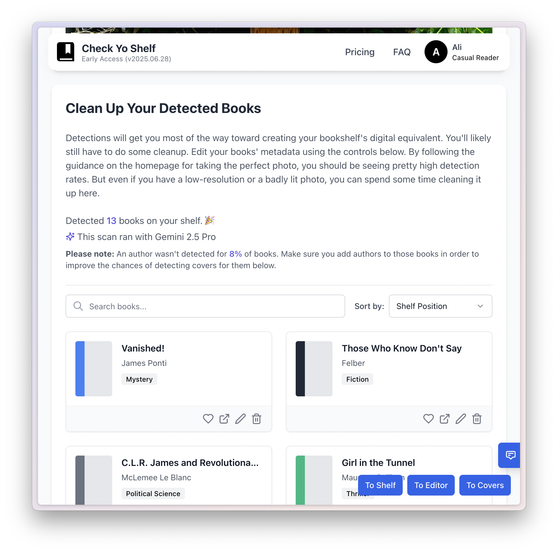
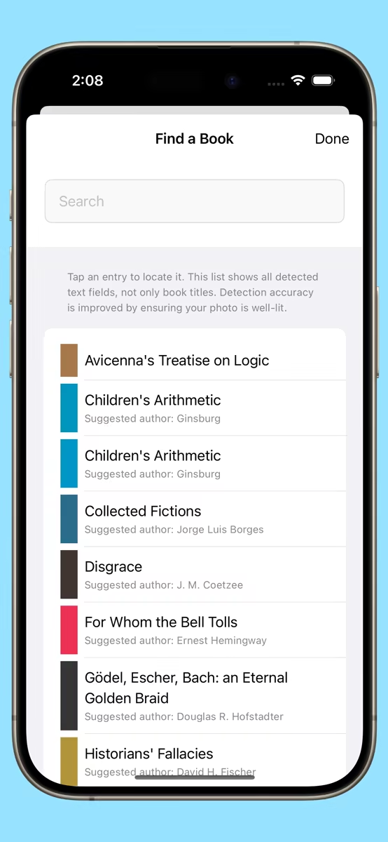
I would run every test photo through Gemini Flash, Gemini Pro, multiple GPT ones, Qwen, and others, and compare their results against two benchmarks: the number of books they detected, and whether they got the book titles and author names right. The combination of both constituted an accuracy score.

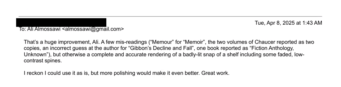
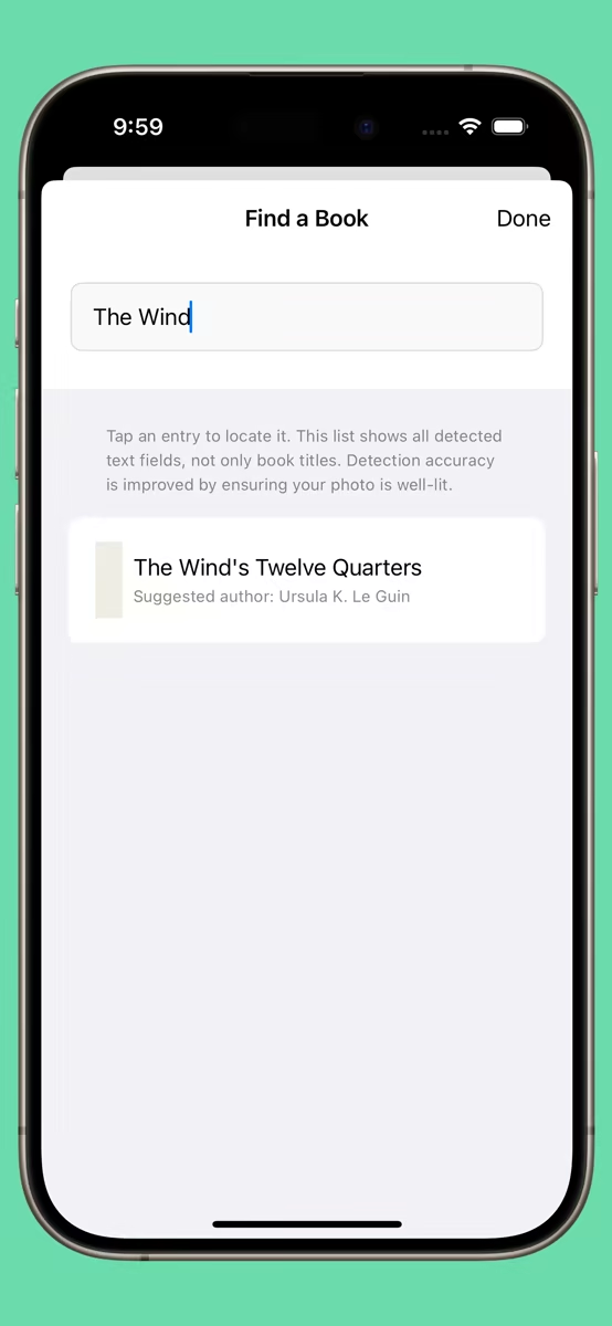
Off the back of that process, the app’s accuracy rate shot up to over 95%. It was amazing how much better it worked.

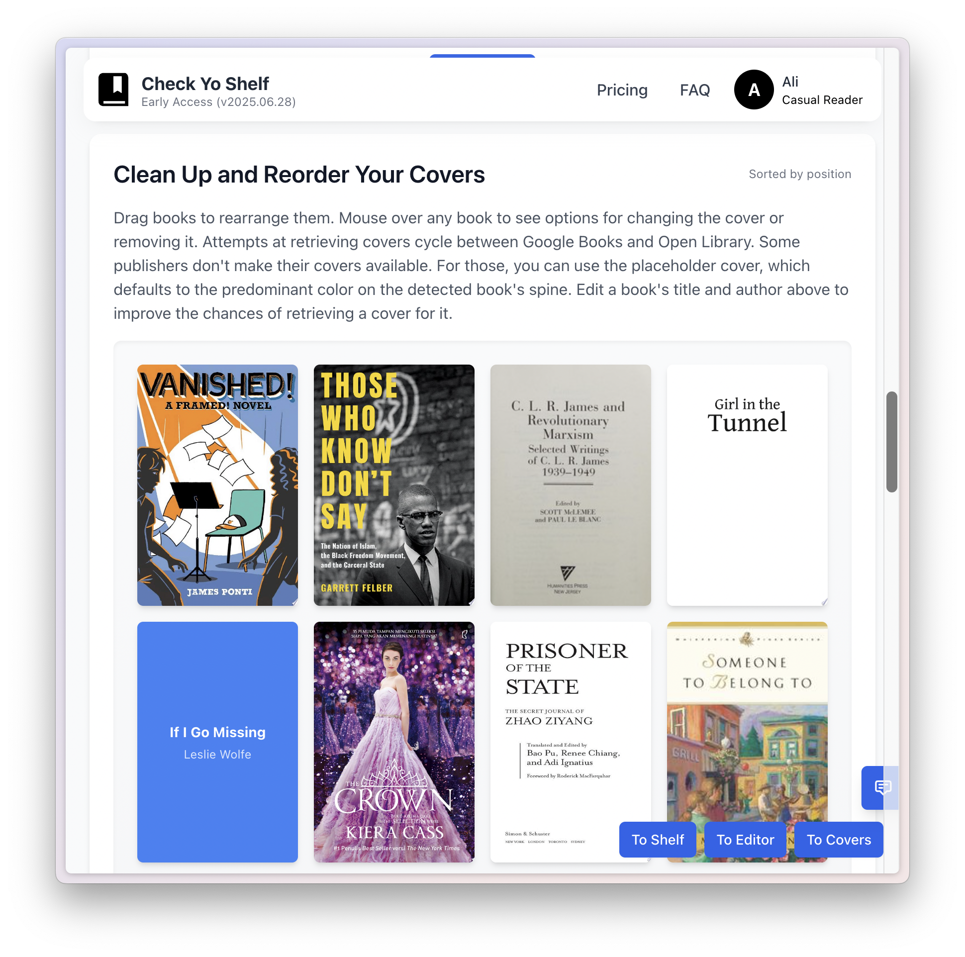
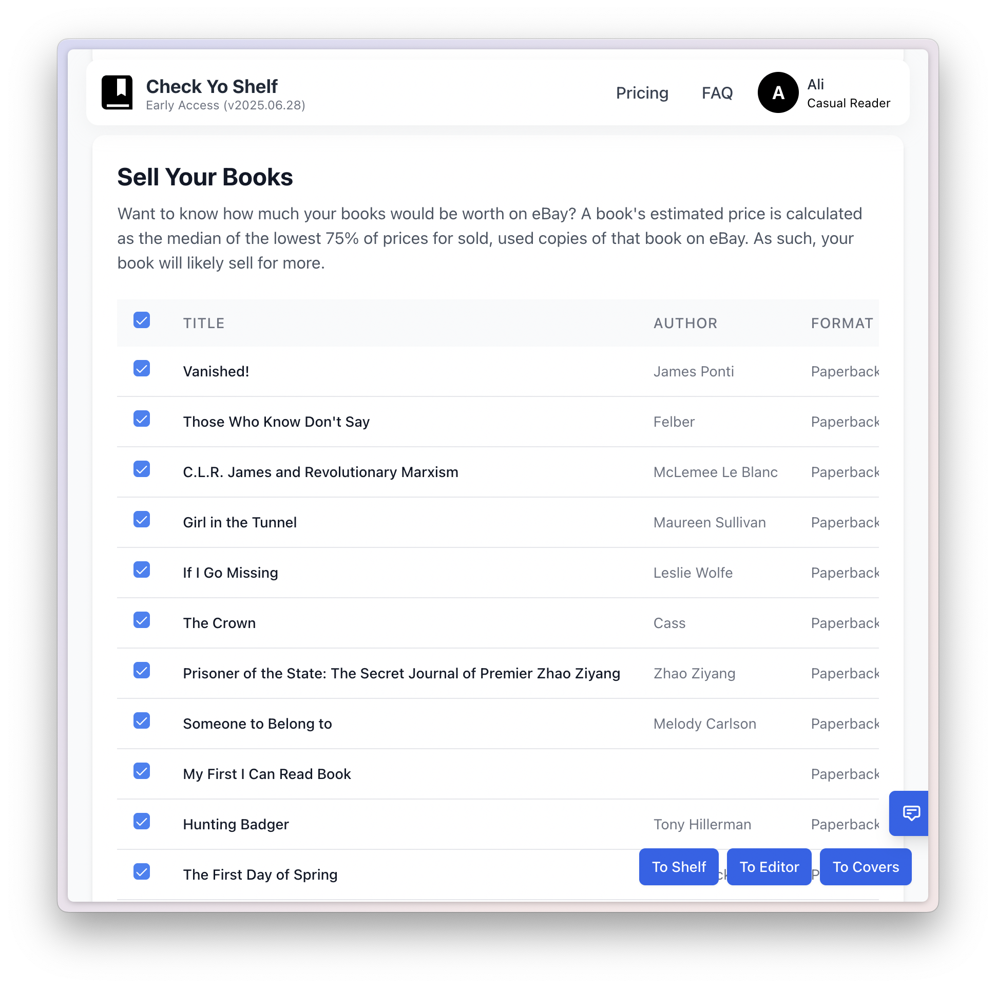
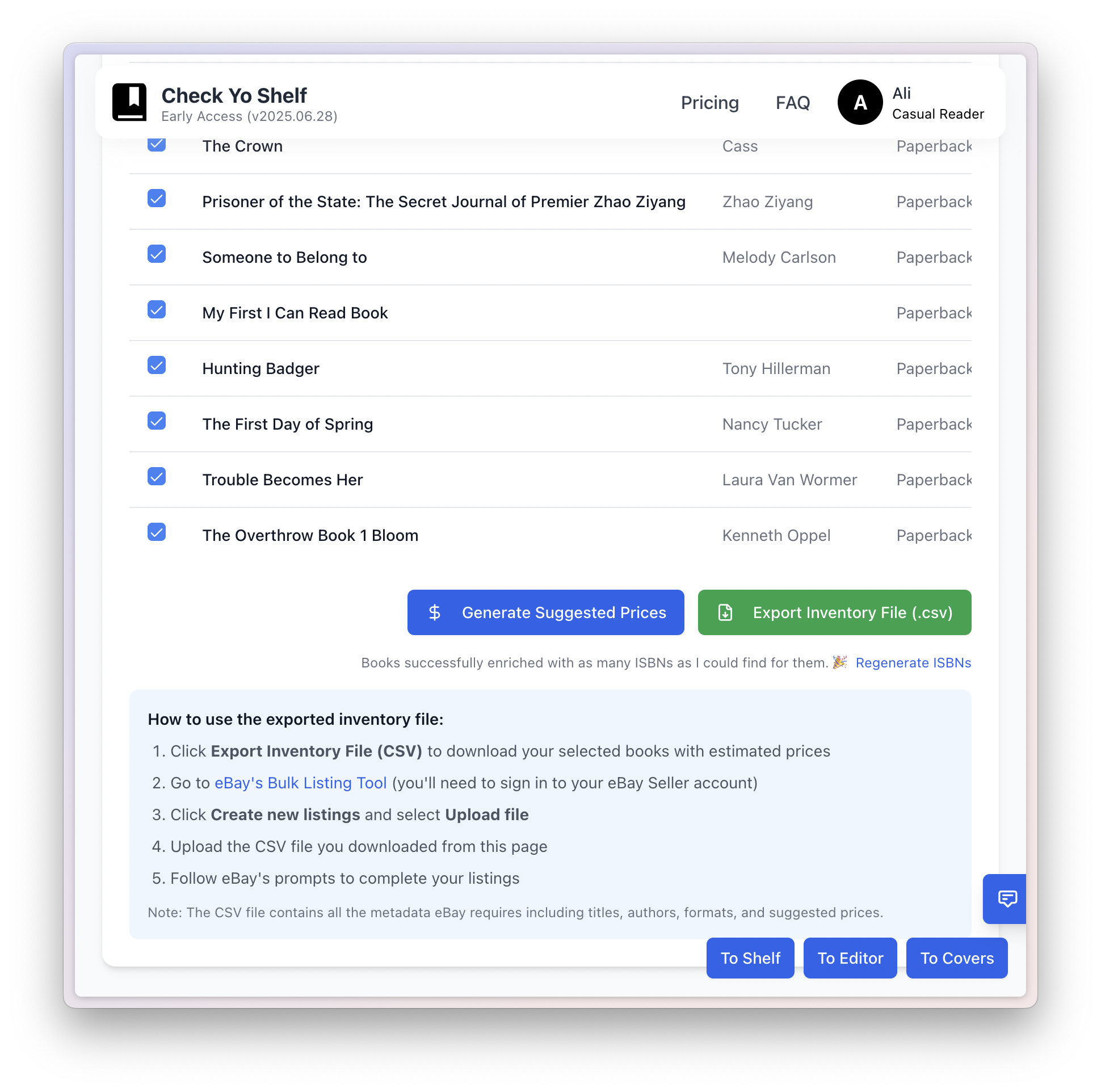
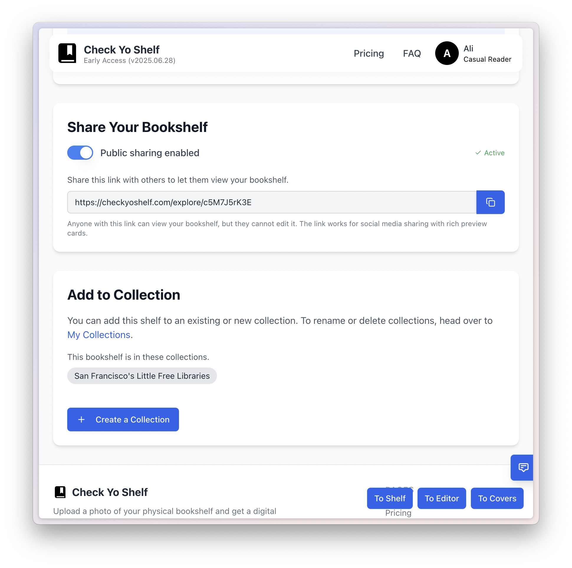
Another benefit of a web app is I knew much more about web apps than native iOS apps, so this time round I built an architecture that was more flexible and fault-tolerant. And as a result, it allowed for new features like reasonably accurate book covers.

The Check Yo Shelf architecture: a React, TypeScript and Tailwind web app with Supabase auth, REST read and write APIs over a Supabase database, book covers in S3 and a DynamoDB cache, enrichment from Google Books, Open Library, Gemini and OpenAI, analytics in Plausible, deployed on AWS Lightsail
Rebuilding on the web meant I owned the whole stack. With the native iOS app, I learned a lot. But now, I could use my experience with web apps to decide on the ideal architecture.

Tangential use-cases

One idea led to others.

The original itch was finding a book. But once a shelf was digitized, more uses fell out almost for free.

01

Find a book

Locate any title across one shelf or several shelves. Check whether you already own a book before you buy it again, which I did more often than I’d like to admit.

02

Share shelves

Create a digital version of your shelf, as an image file or as a live link, and share it with friends.

03

Know what your books are worth

Find out how much your books are worth, especially if you’re looking to pass them on. Generate an inventory file that you can then easily upload to eBay.

04

Catalog for insurance

Keep a dated, photographic record of everything you own, which is exactly what a claim asks for.

05

Find similar or different people

Connect with people who either read the same books or read vastly different books, either as friends or as dates.

The Rebuild

A better app, on the web.

Check Yo Shelf collections page for San Francisco's Little Free Libraries

Visual touches

Details meant to delight.

I spent a lot of time on tiny transitions and cues that made the overall experience a delightful one. With my background in data visualization, there were data graphics worked into the app to show things like generated genres.

Information Architecture

Intentionally simple.

The information architecture was intentionally simple: you had scans and collections, and scans could be part of collections. There was a generous free plan and two paid ones.

Check Yo Shelf information architecture diagram showing scans, collections, and pricing tiers

“That’s a huge improvement… I reckon I could use it as is. Great work.”

The FOMO Go-to-market plan

Showing not telling

I prefer it when someone shows me something useful they’ve done with something. And then I go out and buy that thing. Rather than them trying to sell me the thing.

So the goal for this app was to find some use for it that would get people curious about the app behind that use. As it happened, I was chatting with a friend one time, and he mentioned the little free library in front of his house. And that was it. The hook for Check Yo Shelf would be a guide to the Little Free Libraries all around San Francisco.

I spent a long weekend driving all throughout the city, visiting several dozen Little Free Libraries, taking photos of them, and then running them through Check Yo Shelf. And it worked, people shared the link on Reddit, and I got several dozen signups to the waitlist that way.

And the nice thing about projects that develop organically like that is that little things can spark incidental ideas. In this case, it was to add a feature that allowed you to add shelves to public collections with easy-to-remember URLs.

The Check Yo Shelf page for San Francisco’s Little Free Libraries, with a photo of a tiny street-corner library box and a note that there are over fifty across the city
Browse the collection →

The Sad part

Head the size of a planet, and yet.

This is where the story takes a sad turn. Despite all that hard work, there was no press in front of my house fighting over an exclusive. Not to worry, I interviewed myself, with an interviewer generated through Veo 3, which was one of only a few offerings at the time that did text-to-video. My daughter ran the camera and egged me on. The whole script was improvised, and we shot it in a single take.

Funny aside: I made it to the interview stage with South Park Commons one time, and as I sat across the table from two partners, they started by asking me, stony-faced, “So . . . your idea is called . . . Check Yo Shelf? Like, that’s what you’re going with?” I couldn’t stop laughing at the absurdity of it all. Needless to say, I never heard back.

The project never made it out of early access because I started a new job at Sony, and then at the company I’m currently at. I definitely plan to continue working on it one day.

Five minutes of your life you’ll never get back.

What I Took Away

Three things this taught me.

01

Ship to learn

Three weeks and a real submission taught me more about the product than months of planning would have.

02

Accuracy trumps privacy

I thought book data was personal, and people wouldn’t want that sent out. But actually, they were fine with it if it meant they could get accurate results out of the box.

03

Design and build in public

I’d worked on open source projects in the past, and this time round too, being public, vulnerable, and honest with people caused them to in turn be generous with their feedback and time.