Data visualization for

Laurel Signal

Turning a firm's invisible daily work into clear, measurable intelligence.

Role
Data Visualization Lead, Product Design
Timeline
2025–2026
Team
A small group of subject-matter experts
The Laurel Signal dashboard — an organization summary view layered with a personal billing view

The Brief

Make invisible work visible.

Professional-services firms run on time. Traditionally, people reconstruct their day on a timesheet, and that guesswork becomes the firm's record of what got done. Laurel's activity collector captures the real data automatically. But knowing what work happened isn't enough; a firm needs to see how it happened, and tie those patterns to the outcomes it cares about, starting with profitability.

Signal shipped as a new product, and the visualization work became a reusable system the team kept building on.

Read the full product story on Laurel →

0 – 1 Designed from a blank canvas to a shipped product
25+ Bespoke views, unified into one design system
3 Persona-tuned designs for partners, managers, and associates

The data story

How does work happen?

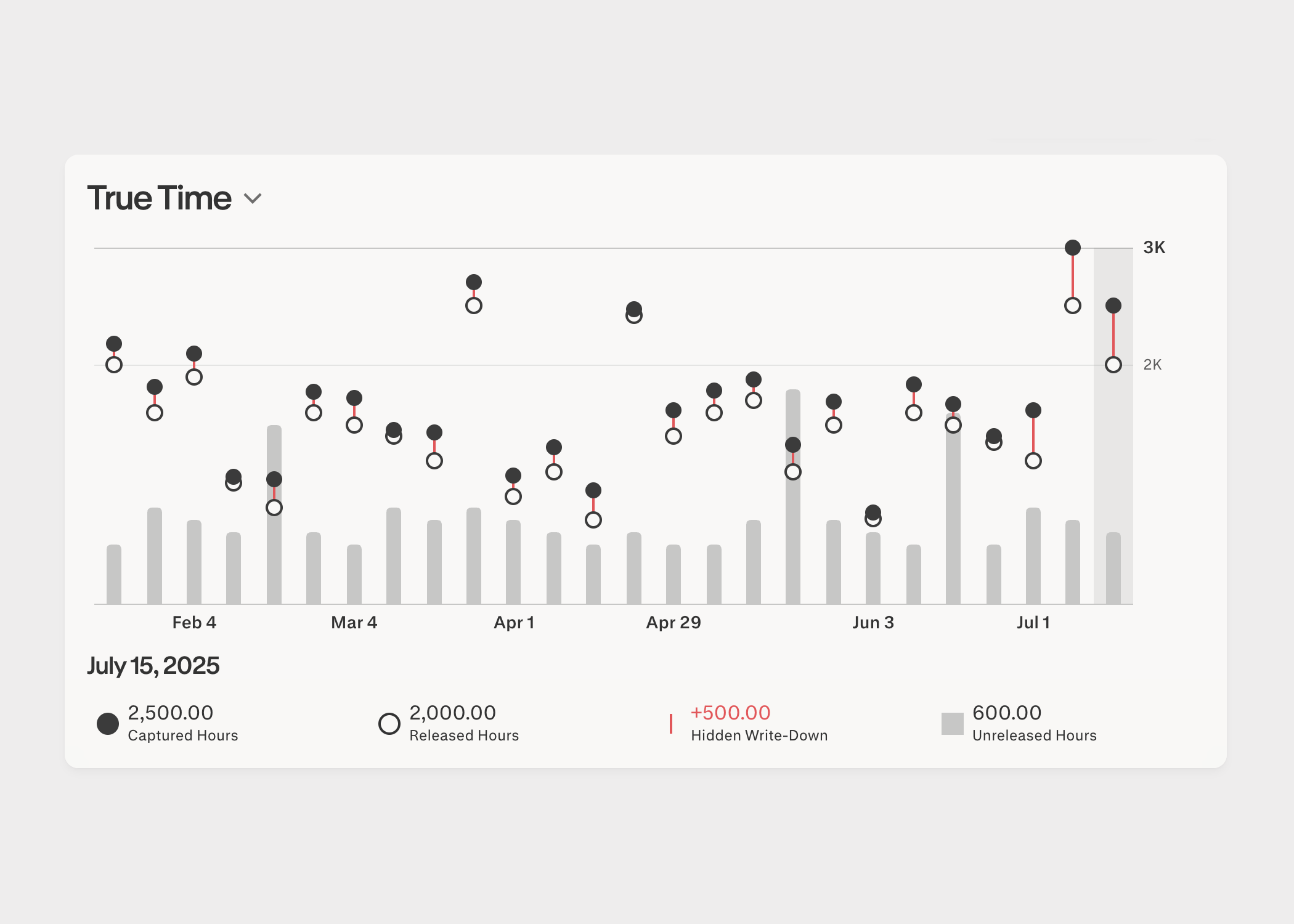
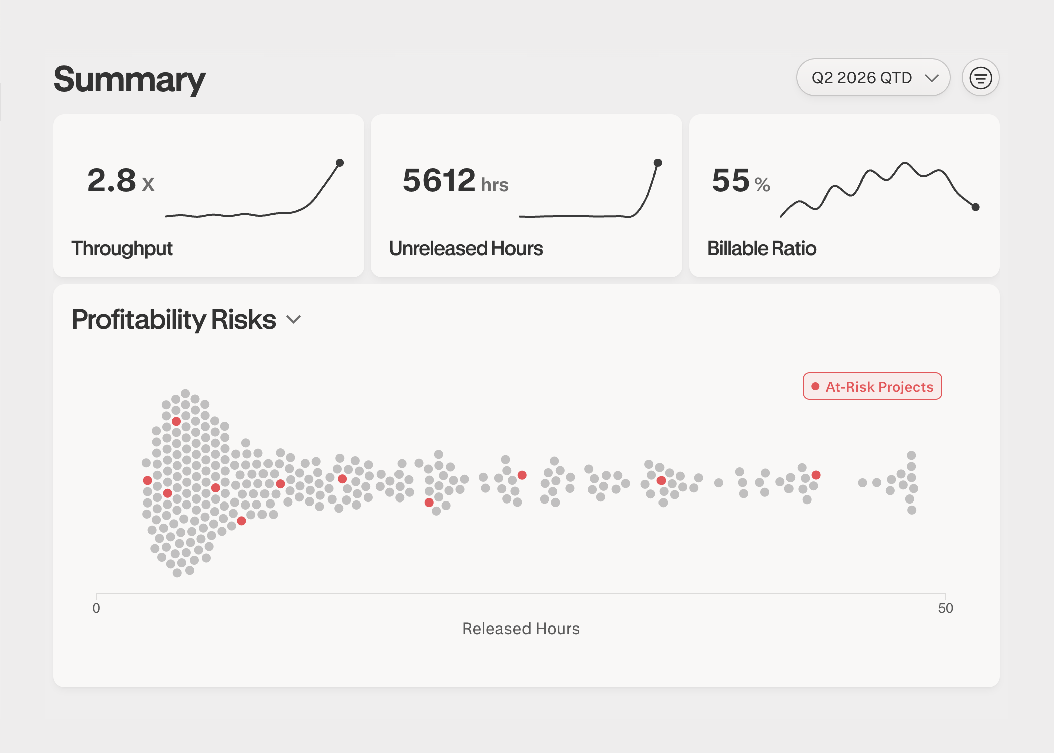
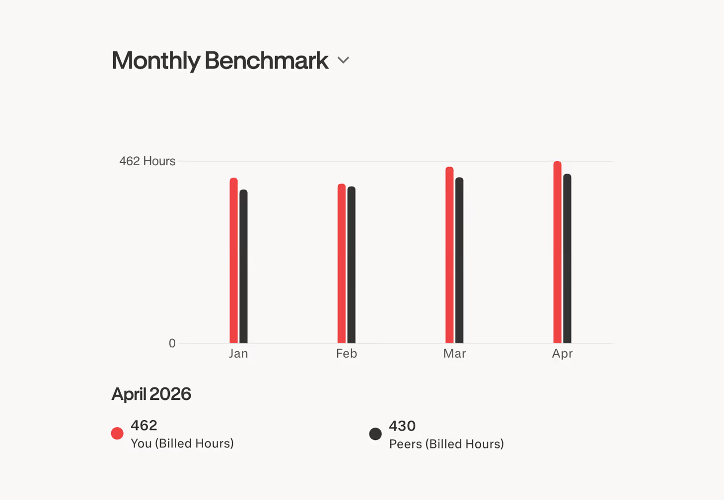
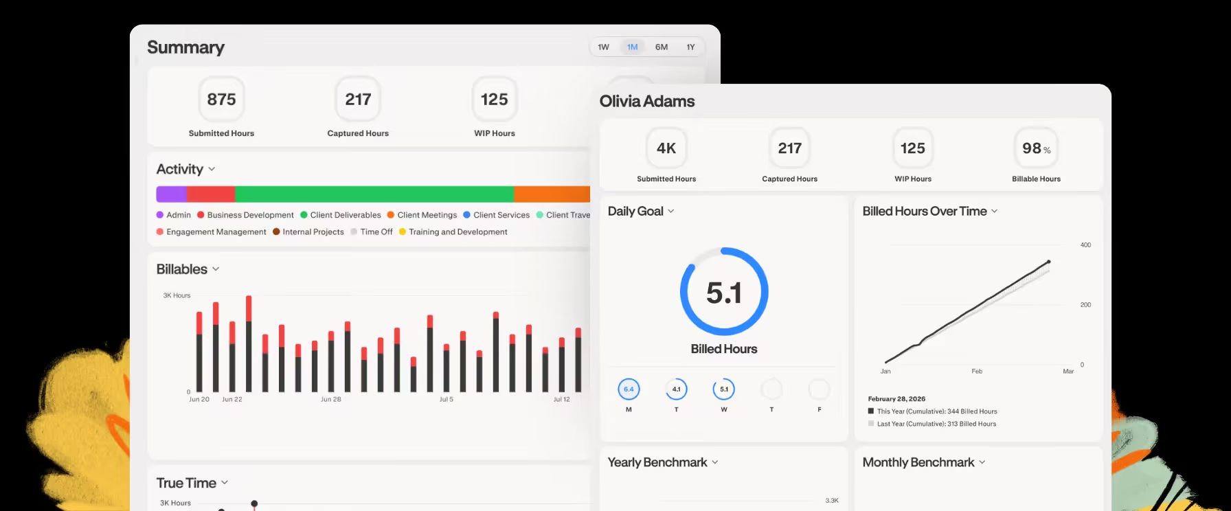
Building that missing piece meant two things: defining the metrics that capture how efficiently a firm operates, and presenting them so a leader could move from a one-line summary to the detail behind it. I owned the data visualization for both, end to end.

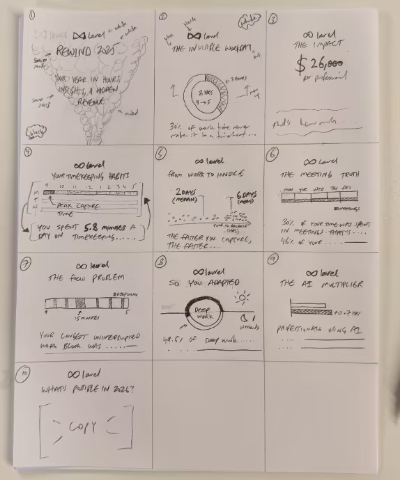
Visualization was the product's core value, so the bar was high. Every component had to read instantly, hold up in print as well as on screen, and stay consistent across the platform. Working alongside the founders and a handful of domain experts, I designed and specced these components, then tuned them for each persona: the partner scanning for risk, the manager running a book of work, the associate tracking their own hours.

A hand-drawn paper storyboard of ten Signal visualizations, sequenced as a year-in-review narrative from Rewind 2025 through The Invisible Writeoff, The Impact, and What's possible in 2026.
I still think best in pencil and paper. The loop from there is fast: sketch, prototype in code, then share a short screen recording for feedback, usually inside a day.

Designing the Visualizations

Deliberate, opinionated, restrained.

Every figure started from a single question a firm needed answered. Visual encodings followed from that, favoring simple, ubiquitous ones over novel ones that demanded extra cognitive burden to understand. Here are examples of three of over two dozen figures we designed and built.

The True Time chart: a double-lollipop plot pairing captured and released hours each day, with the hidden write-down drawn as a red bar between them and unreleased hours shown as gray bars

True Time

Drawing the gap instead of asking the brain to compute it.

A number that matters a lot to a firm leader isn't hours captured or hours submitted, it's the write-down that occurs as a result of the difference between the two numbers. Real work that quietly never makes it onto a bill. When that difference is the crux of the story, the visual encoding we choose ought to make it obvious how big or small these differences are, so that days with long red lines clearly indicate work that has gone unbilled.

Why a double lollipop, not two bars?
Side-by-side bars force the eye to estimate a difference from the negative space between their tops. It's a subtraction the brain has to compute, slowly and imprecisely. The double lollipop encodes that difference directly as one red segment, so the quantity you actually care about is drawn on the page rather than inferred.
The Summary view: throughput, unreleased hours, and billable-ratio stat cards above a Profitability Risks beeswarm plot, with at-risk projects highlighted in red

Profitability Risks

At-risk projects at a glance.

A first principle in information architecture is to present information as summary first, detail second. The Profitability Risks view collapses a firm's projects into a beeswarm, so a leader can see at a glance which projects warrant attention and how the whole book is distributed by billed hours. Headline metrics at the top carry sparklines for the time-series behind them.

The key decision
A beeswarm trades a precise y-axis for shape. You give up reading an exact value off an axis, but you gain an instant read on where the risk clusters, which is the decision this view exists to support.
The Monthly Benchmark chart: paired bars comparing your billed hours against peers over four months

Monthly Benchmark

Comparison without a leaderboard.

Benchmarking should give a person a reason to become better, not make them feel inadequate or paranoid about it being used for micromanaging. This figure helps a person know if they're on track rather than who's winning. Each month pairs a person against an index from their peer group. Colors remain consistent across figures, with red encoding the more salient data point, and black encoding the secondary one.

The key decision
Using pairs of bars over time satisfies the goal of optimizing for readability and establishing a clear connection between a metric and an outcome (profitability). It avoids being needlessly clever with novel approaches.

The System

Principles that held it together.

01

Earn every exception

Default to the most familiar encoding that answers the question. We earned exactly one exception, the double lollipop in True Time, because there the difference was the whole story.

02

Color carries meaning

Red always marked the salient or at-risk value; black, the reference. One legend grammar and one set of interactions, reused across all 25+ views.

03

Summary, then detail

Lead with the headline a leader needs, then keep the detail one scroll away. The beeswarm and sparkline patterns came straight out of this.

Hear Laurel's CEO talk about the product

Why we built Signal.